How to Choose Your Wedding Color Palette

Everyone knows that figuring out the logistics of a wedding is stressful. What venue to choose, where to get rentals, what caterer to use, how many people you’ll invite; it’s a lot to think about! But once that’s all sorted, it turns out that even the “fun” parts of wedding planning – aka the event design like colors, decor, and florals – are stressful too! There are a lot of choices to make, and you and your partner may not always agree. Picking out your wedding color scheme may take a lot more forethought than you originally planned: How does the season affect what colors you choose? How many colors are too many? What if your partner wants hues that don’t mesh with your vision at all, or you can’t find rentals in the color you were planning on using?
This article will cover these questions and more, including how to adjust your color scheme depending on the venue, where exactly to incorporate your colors throughout your wedding, and how to make any two colors look good together. Design choices aren’t as easy as everyone makes them seem, but they can still be intuitive and fun! It’s our hope that by the end of this article, you and your partner will feel much more confident about picking your wedding color scheme. You can even use the Graphic Designer to put the finished palette together!
When Should I Plan My Wedding Colors?
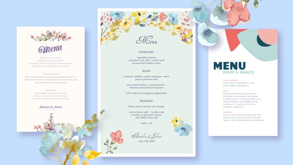
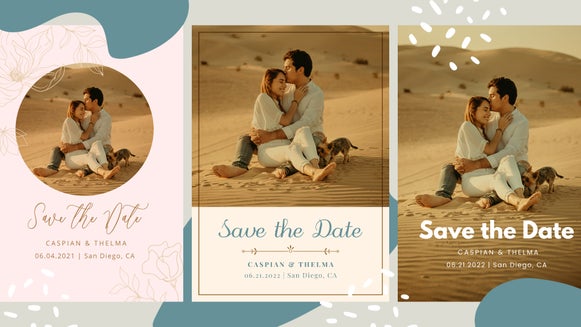
Picking your color palette is actually the first step in wedding planning. This is because you’ll be sending out save the dates and invites long before the wedding party picks their outfits. Your wedding invites don’t have to match up with the rest of your wedding, but doing so ensures a consistent theme from start to finish. This makes the entire event seem more planned and polished – even if the rest of the details are still up in the air. Not to mention this makes for some really wonderful flat-lay wedding photos.
Choosing Your Wedding Color Palette: First Steps
The very first thing to do when choosing your wedding color palette is to discuss it with your partner. You don’t want to get attached to a particular idea only to find out that your fiancé has a completely different vision than you! But not to worry – even if they do, there are ways to compromise on color schemes while keeping both your favorite colors in the mix.
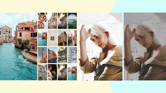
Pinterest is a great way to find wedding inspiration pictures, and the Collage Maker is wonderful for putting together a cohesive vision board to show your partner or planner. You can arrange the images yourself or use the Collage Wizard for a one-click collage-making process.
How Many Colors Should I Have in My Wedding Palette?
You should have at least one primary color in your wedding palette to dictate your wedding party and decor. Yes, you can get away with just one! But it will result in a very monochromatic wedding, so you should at least use two different hues (e.g., dark pink and light pink) to add some variety. Remember, if you’re having a traditional Western wedding, your dress will probably be white or ivory; white is also the cheapest color for rental tables and chairs – so even with just one accent color, this will add some visual contrast.
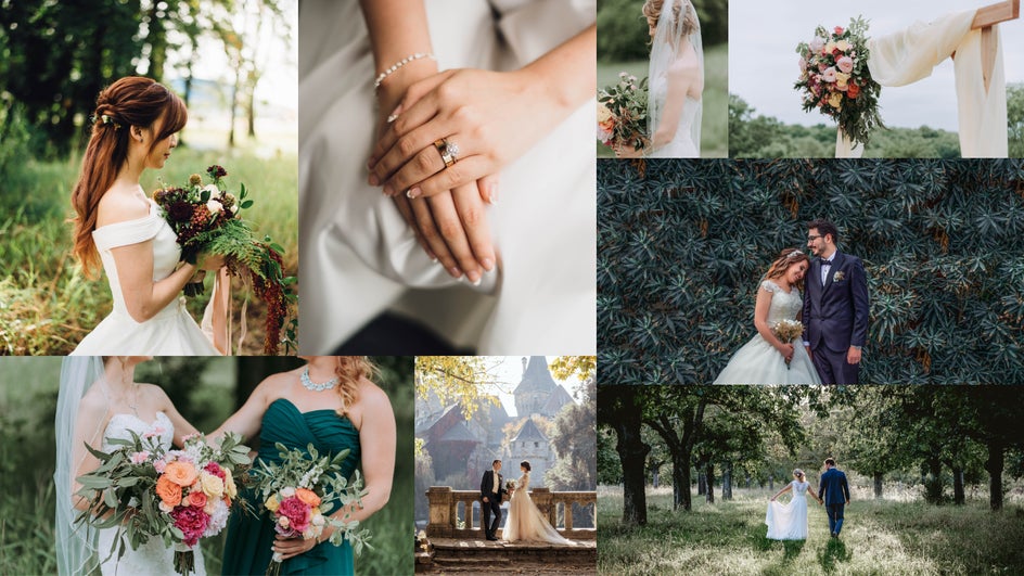
In the following color palette, there’s just one chosen hue for decor: The different shades of brown. However, the white of the dress and the natural scenery add white and green to the palette!
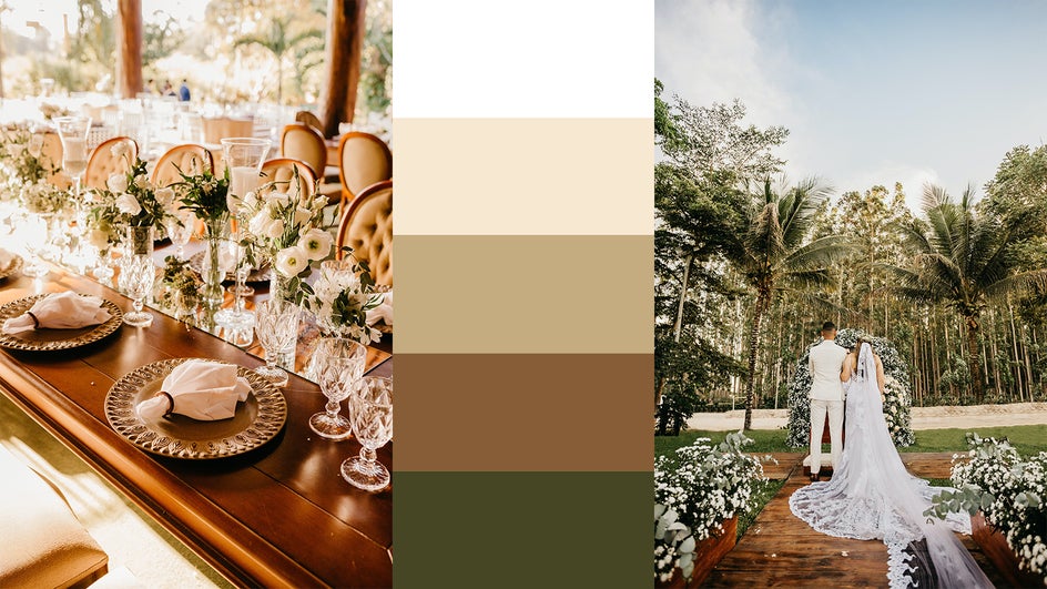
The monochromatic look isn’t for everyone. Most people would prefer at least two primary colors. These will show up in the bridal party’s outfits, in the florals, all the printed items, and in the centerpieces. Then you’ll have either anywhere from 1-3 secondary colors. If you’re using just one secondary color, it’s probably white or close to white (or black if you’re planning on a darker palette). If you have three secondary colors, then one of these should really just be an accent color in a different hue.
In this pastel wedding, pink and teal are the two primary colors. Notice how the darker accent colors are simply different shades of those same base colors.
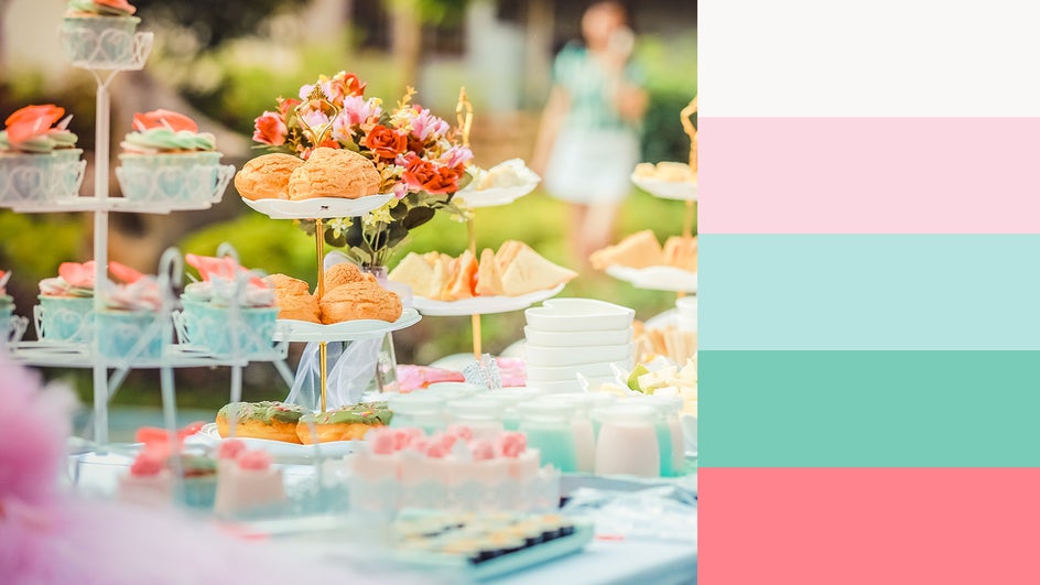
So the answer is: Anywhere from 3-5 colors, but one will be either white or black, and at least three should be in the same color family – otherwise, the event begins to lose its coherence.
Wedding Color Palette Inspiration
There are a lot of colors out there! How do you pick just three or four? To begin with, you probably have some idea of what colors or at least what tone you want at your wedding. For instance, most people prefer either a bright palette or a dark palette.
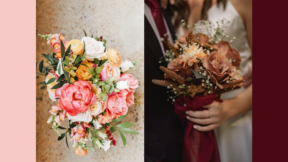
Typically, certain seasons are associated with certain colors – so if you’re having a spring wedding, you might lean toward delicate natural colors like ivory, sage green, and lavender. If you’re having a fall wedding, you may be more inclined to earthy tones like forest green and terracotta.
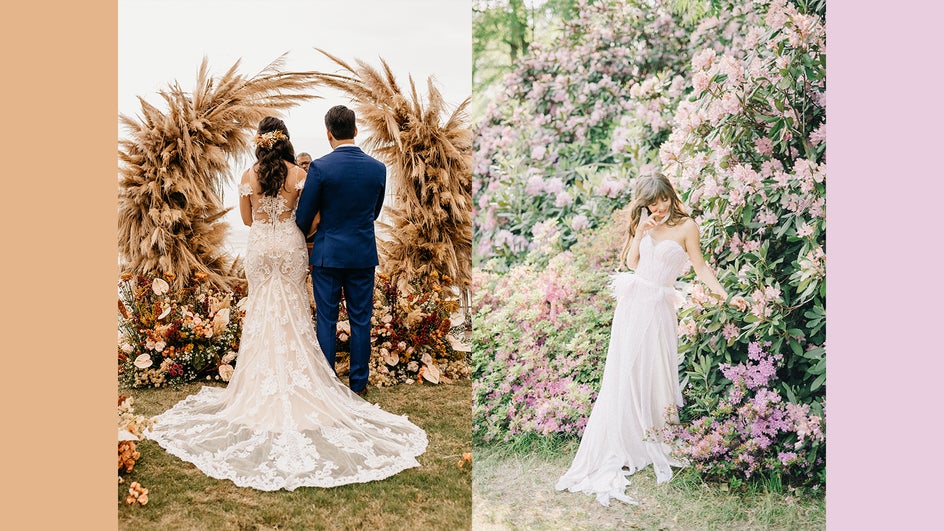
It’s not necessary to do this; there’s no reason not to have a sage-and-lilac wedding in the fall, but it may help your event feel more cohesive, and will definitely help when it comes to finding florals and decor. If you’re having a hard time choosing a color palette, the season of your wedding date is a great place to start.
Your location will also impact your wedding colors, so it’s usually better to have your palette in mind before you pick the venue. The location may fit an aesthetic that already has colors associated with it, or even have colored decorative elements in place. If you’re having trouble deciding on a color scheme, then let the venue do it for you! For instance, outdoor weddings can pull from the scenery around them – if you’re having a beach wedding, neutral tones make the water pop; if you’re somewhere very green, bright colors will complement the scenery.
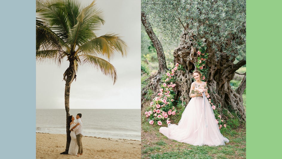
If you already have a specific wedding style in mind – elegant, rustic, boho – you can let this influence your wedding colors as well. For example, if you’re thinking of a celestial-themed wedding with moons and stars, you might want to use gold and navy blue as your accent colors. If you’re planning on a Western wedding, sepia-inspired neutrals, and a rust-red accent might be the way to go.
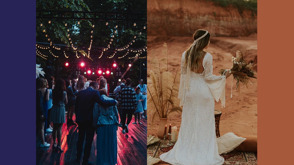
Even if you’re not sure what color scheme you want at your wedding, you’ll definitely know what colors you don’t want, so don’t betray your instincts just for your parents, trends, or your bridal party!
That said, if you and your partner are leaning toward completely clashing colors, there’s always a way to make them work together.
How to Compromise on a Wedding Color Palette
If you and your partner are at an impasse about wedding colors, there are a few ways to compromise. Let’s start with this clashing color scheme:

In this case, the colors are clashing for a few reasons: The red and orange are warmer than the purples, but not warm enough to provide complete contrast. The purples are very bright compared to the darker, lower-saturated red and orange. But orange and purple don’t need to clash; in fact, they’re complementary colors and naturally lift each other up. So here are a couple of ways you can fix the palette:
Method 1: Adjust the Saturation
This method involves making some of the colors in the palette brighter or darker. Weddings usually photograph better and look more timeless if you use natural colors, and very bright colors don’t appear in nature often. So let’s try decreasing the saturation of the purples in this palette:

These line up much better with the reds and oranges. This is a very rich, autumnal color scheme for a truly unique wedding.
Method 2: Adjust the Temperature
The temperature of a color is essentially how close to blue or red it is. Colors closer to blue are cool colors, while those closer to red are warm. So, to make a color warmer, just slide it closer to the red and orange side of the color picker; to make it cooler, slide it toward the blue.
This method works in either direction. Making the purples warmer will bring them closer in temperature to the reds and oranges. Making them cooler will provide extra contrast. Either way, it eliminates the problem of clashing. Note that adjusting the warmth will change the look of a color slightly! Here’s what happens when you make the purples warmer:

And here’s what happens when you make them cooler:

These are both significantly better options than the original palette.
Method 3: Adjust Saturation & Warmth
You can use a combination of the first two methods to help your colors get along while still maintaining the original hues.

In this case, we made the purples warmer and decreased the saturation. This resulted in purple tones that stayed true to the original colors while still partnering better with the red and orange.
These methods work with any colors, and also come in handy when you need to adjust your palette to work with your venue’s decor.
How to Use Your Wedding Color Scheme
Your wedding color scheme can be incorporated throughout your wedding to tie the whole event together. So where exactly should your wedding color palette come into play? Here’s a list of all the different places you might want to use your wedding colors:
• Florals: Wedding bouquets, bridal party bouquets, boutonnieres, centerpieces, arches
• Decorative accents: Ribbons, vases, napkins
• Printables: Save the dates, invites, thank you cards, signage
• Clothing: Bridal party outfits, hair accessories, shoes
• Other: Cocktails, ring boxes, wedding cake
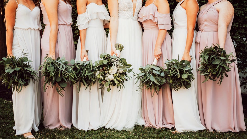
Of course, you can use your color palette for rentals like tents, tables, and chairs as well, but getting these in different colors is often very expensive. It all depends on your budget and style!
Plan Your Wedding Color Palette Today
Choosing your wedding color palette should be fun, not intimidating. Now that you’ve gotten some inspiration, it’s time to start the wedding planning process and pick the colors that work best for you and your partner. You can use the Collage Maker to put together your inspiration, while the Graphic Designer is a great space for playing around with different colors. Here’s to finding your perfect match!
