The Complete Guide to Minimalist Graphic Design

We’ve all heard the saying, “less is more”, but have you ever thought about how this concept applies to your graphic design projects? Minimalism in design isn’t anything new; in fact, the idea of paired-back elements and negative space can be traced as far back as the 12th Century in Japan.
If you’re interested in learning more about minimalist graphic design, you’ve come to the right place. In this guide, we cover what makes a minimalist design, as well as the 5 key rules to help you achieve the minimalist graphic design trend!
What Is Minimalist Graphic Design?
Minimalist design is about removing the unnecessary and focusing on what's essential. The concept of minimalism is commonly used across architecture and industrial design, as well as graphic design. This means using simple lines and shapes, bold colors, paired-back fonts, and limited text, all with the goal of creating an easy-to-understand visual message for your audience.
Minimalist graphic design is particularly popular in contemporary marketing campaigns because it allows you to communicate your brand message quickly and effectively, while using a clean and modern aesthetic.
There have been many famous minimalist graphic designers who have shaped the minimalist trend over the decades. These include Mies van der Rohe (who popularized the phrase “less is more”), Massimo Vignelli, and Dan Flavin, among others.

5 Rules for Achieving the Minimalist Graphic Design Trend
So, what are the 5 most important features of minimalist design? Here’s everything you need to know about how to get the minimalist look.
1. Limit Your Color Palette
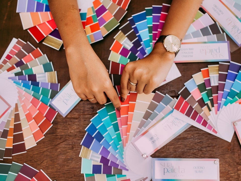
A minimalist graphic design should use no more than two or three colors. This is because there's less visual noise, allowing the message to be communicated clearly without confusion.
When considering what colors to include in your design, there are some color schemes that work well with minimalism:
Monochrome
Using variations of just one hue or color can make your design feel modern and sleek. You might opt for shades of black and gray, for example, or team a light and dark shade of red throughout the entire design.
Complementary
Complementary schemes are made up of pairs of opposite hues (for example, blue and orange or red and green). They produce high contrast which makes them stand out well against other elements within the composition.
Triadic
Triadic schemes consist of three different hues spaced evenly apart from each other along the color wheel, resulting in stronger visual impact due to their inclusion of opposing tones.
Analogous
Analogous schemes consist of hues that are next to each other on the color wheel. This creates a more subtle effect than complementary schemes, but they still provide high contrast.
The fewer colors you use, the easier it is to make them stand out. You can also use different shades of one color for variety. The key is not to overdo it by using too many different hues, particularly if you're creating a logo or graphic design with multiple elements.
2. Create Balance With Negative Space
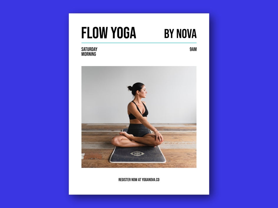
Negative space (or "white space") is the empty space between graphic elements (like your text, images, or shapes) and the background of your design. It's important to use negative space in your designs because it helps create balance, which makes your minimalist design look more professional and cohesive. It can also be used as a way of adding more impact to your design by drawing attention to certain elements of it.
Additionally, negative space is important to help separate the different elements of your design. For example, if you have text and an image next to each other on a page, the area around the text helps delineate it from the image.
Remember, when it comes to the minimalist graphic design trend, less is always more.
3. Use Clean and Straightforward Fonts
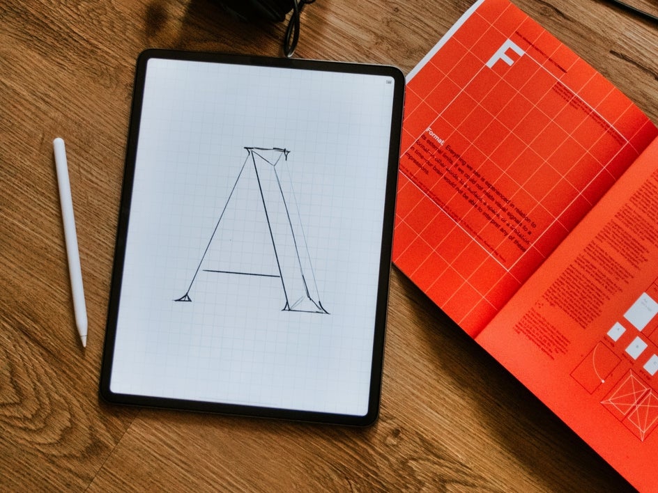
When you're choosing fonts for your minimalist graphic design, look for one that's easy on the eyes and not too fancy. For this reason, minimalist graphic design often uses clean and simple Serif and Sans-Serif fonts, rather than more decorative styles.
Also, try to limit yourself to two fonts at most: one for headings and another for body text. You may also want to pair your chosen fonts together based on their style, color, or size. For example, if one is italicized, you'll want to make sure the other isn't.
Thankfully, we've got a handy guide to font pairing to help you out!
4. Utilize Grids to Maintain Order
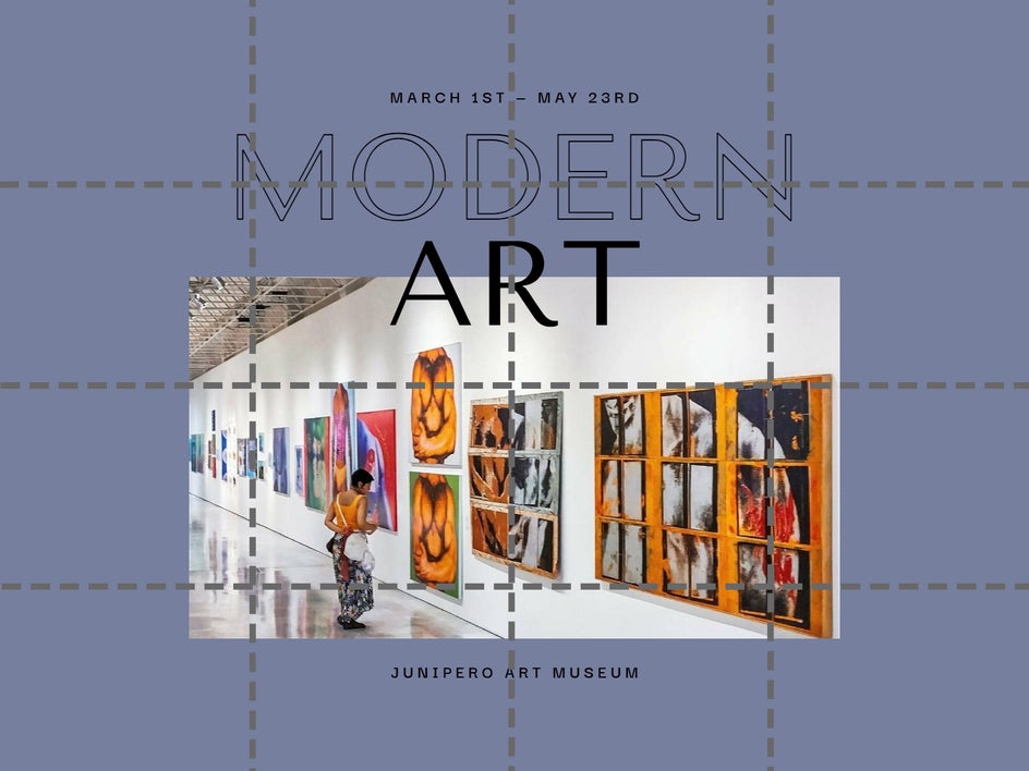
Grids can be used as a framework for organizing content. Grid systems are made up of a series of columns and rows, which can help you define where your text, graphics, or other elements should appear.
Ultimately, they help you to create a consistent look and feel across your design, which can be used to emphasize certain elements or de-emphasize others. Grids are also especially helpful when working with text, as they ensure that your paragraphs, headers, and other important information all line up properly.
By creating your minimalist graphic design using a grid-like structure as a guide, it can help you to space out your elements evenly, achieve the perfect balance of negative space, and even create a visual hierarchy (which we talk about more below).
5. Simplify User Experience With Visual Hierarchy
Visual hierarchy is a design technique that uses size, color and position to help users understand the content. It's also used to create a clear structure that helps viewers find information quickly and intuitively, thus forming an important part of minimalist UI (user interface) design.
The idea is to use visual cues to show users which elements are most important, and then guide them through the design based on those cues. It's important that these visual cues are consistent throughout your minimalist graphic design, so that users can easily understand where they should look next.
It's also vital to note that your graphic design doesn't have to be super complex in order to be visually appealing. You can use simple shapes and colors to create an impactful minimalist design. A minimalist logo like those of Nike or Apple, for example, usually consists of just one or two colors and a few basic shapes, yet they remain memorable and eye-catching.
Embrace the Minimalist Graphic Design Trend With BeFunky
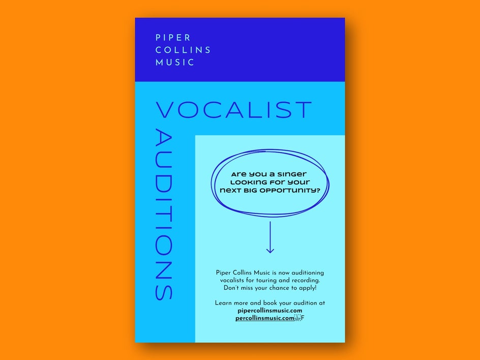
Now that you know what makes a minimalist design, it’s time to try your hand at creating your very own. Whether you want to design a minimalist graphic design poster, logo, social media post, or any other marketing template, BeFunky’s Graphic Designer has got you sorted! Simply choose from hundreds of pre-designed and eye-catching templates, then swap out the text, graphics, or color scheme for exactly what you had in mind.
Try the Graphic Designer today to see just how easy creating a minimalist design can be!


