How to Use Cooler Tones in Your Photo Editing
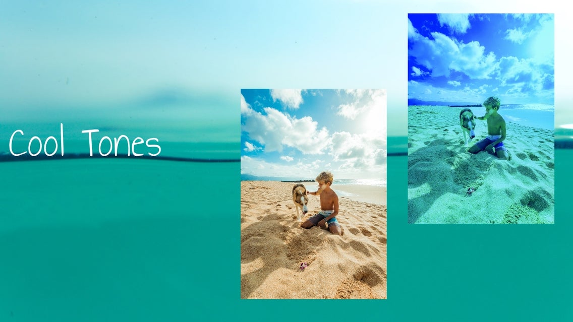
Cool tone photos have a calm almost magical feel. If you are considering a cool tone aesthetic for your social media feeds the BeFunky Photo Editor is a great way to change the mood post-shoot. And your photos will stand out and make a calming impact.
To get a cool tone, we can use filters in cool hues of blue. First, in the editor, click Effects and then choose Cooler.
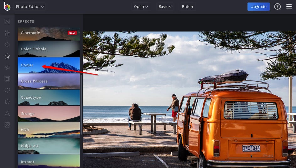
From here, we can adjust to get the look we want by clicking on the settings and then using the sliders.
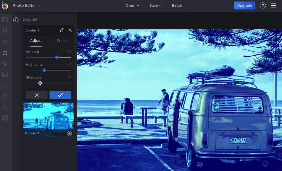
Here, I have chosen to leave the effect at 70% so the van has more details and is not completely blue. Then I played around with the highlights and shadows to brighten the sky and put more focus on the people and ocean in the background. For a more eerie effect, you could up the shadows to darken the foreground even more.
Though the original photo is bright and great, changing this photo to cooler tones makes different details pop out from the original and creates a different feel. This makes an interesting social media feed, gallery wall, or even travel album.
Cool tone likes blue, violet, and green mimic the calming effects of nature. They can also evoke a sense of sadness if that is what you are going for. The color temperature sets a mood.
Green is great for nature photos and violet can give that royal upscale feel. So let’s look at a couple more examples.
This time, we have a picture of a forest that I want to change to make it greener. Instead of using Cooler under Effects, let’s try going to Edit and then Color.
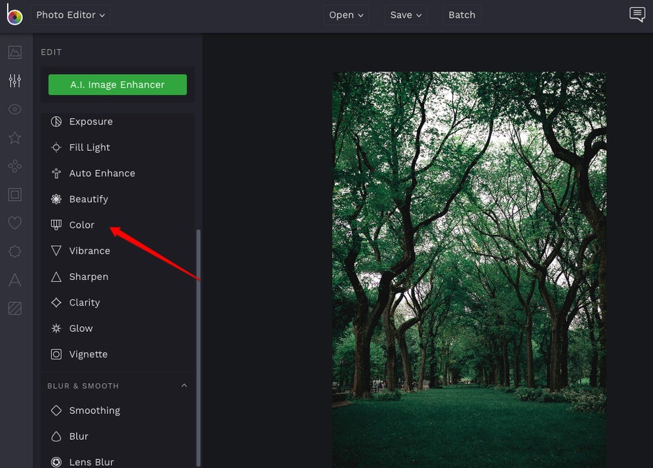
Here I can put the hue into the green range and then take the temperature down to a cooler tone.
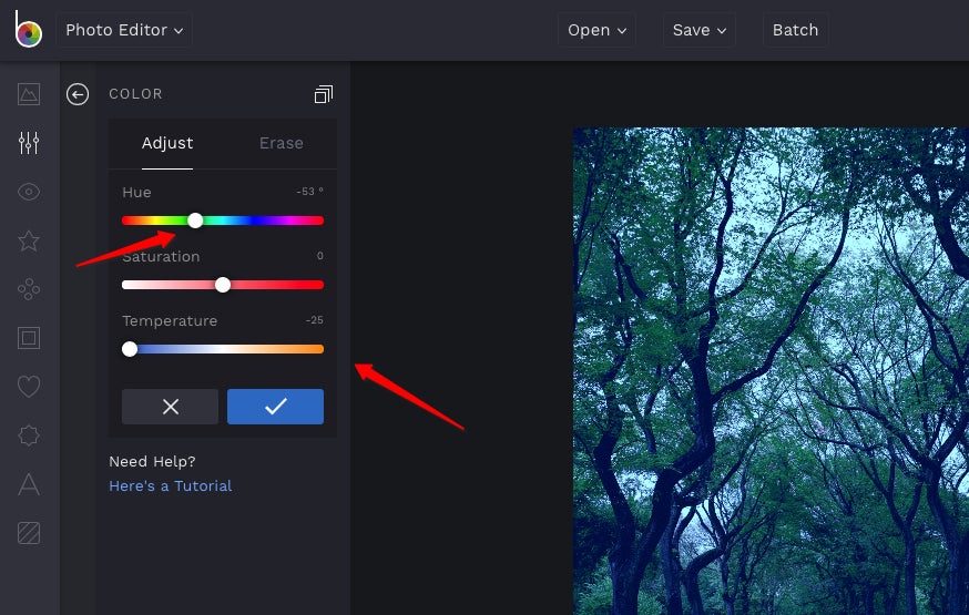
This definitely gives an eerie feel. Not sure I want to venture into those woods at twilight. If that is what you are going for, great. Or you can play around with the brightness to bring it back up a bit.
If we take this same photo and up the brightness, under Exposure, we get kind of a retro feel. A completely different look. This one could make a great poster background for a music festival in the forest don’t you think?
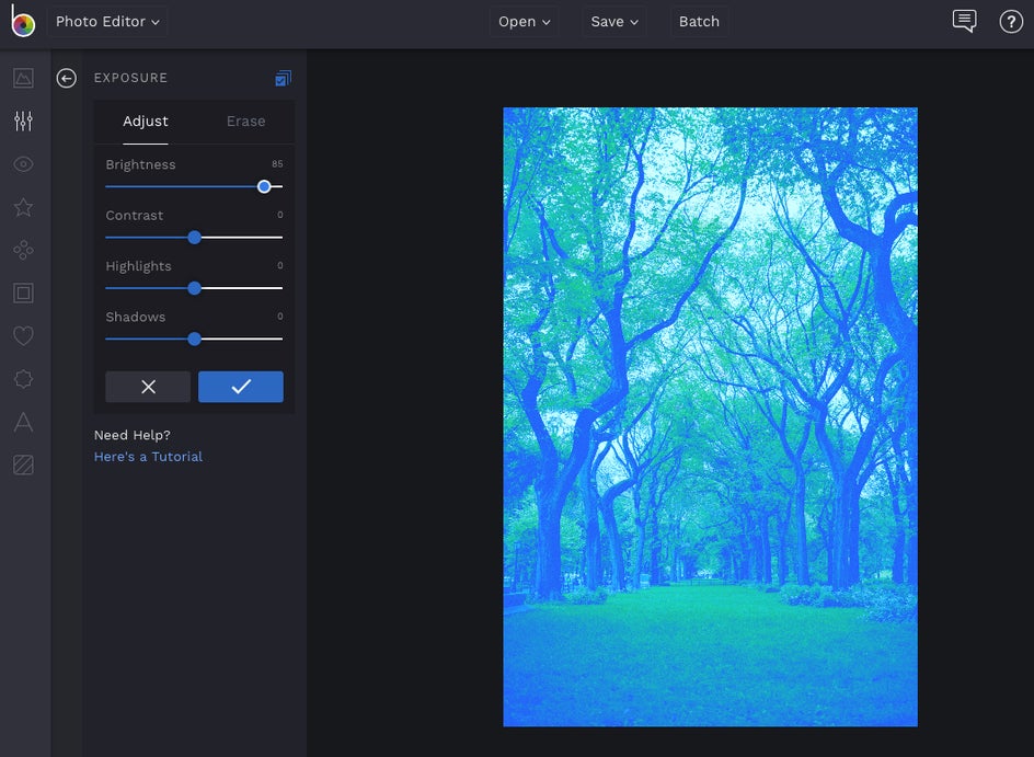
Both photos contain blue and green cool tones but have different moods. This goes to show the big impact that a few adjustments can make. Play around with the hues, effects, and exposure to achieve the mood you are looking for when using cooler tones.
Now that we've experimented with how blue can transform your image, let's create something a little more luxurious by using violet. Using the same method from the color tab as before, let’s move the slider to the purple hues.
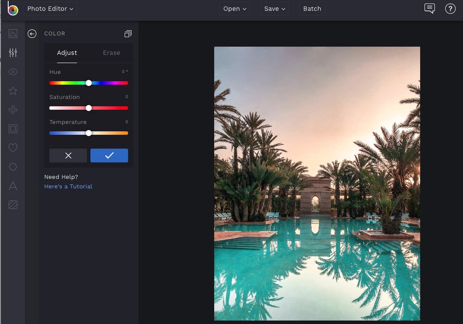
And then lower the temperature.
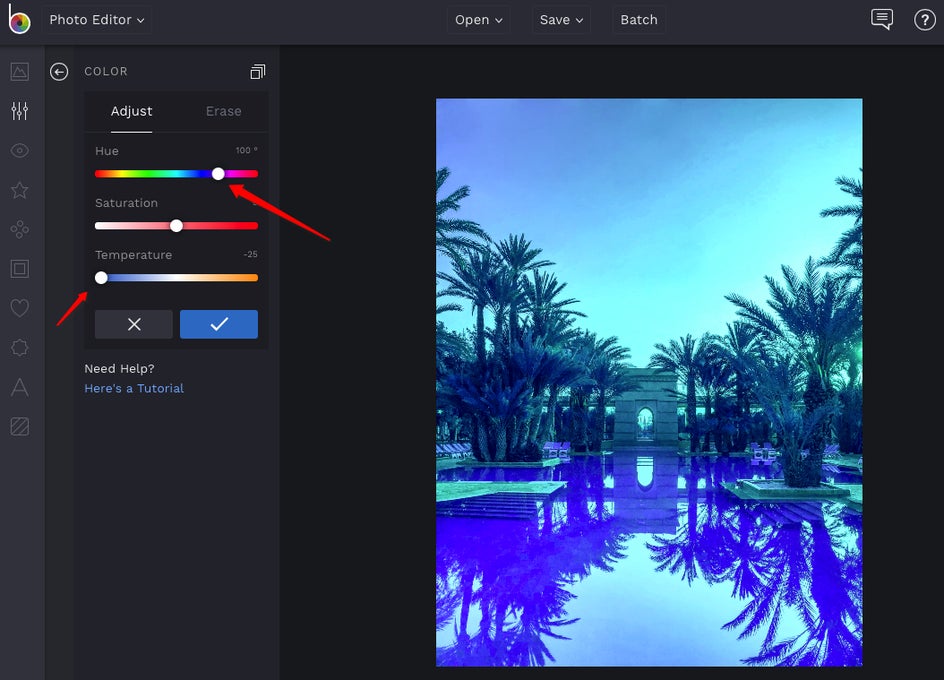
Again we get a different mood with the cooler tones but changing a photo to a more monochrome color palette can also make the image less distracting. This is perfect if you are using it for a background like for a magazine cover or even for a social media image with text.
Here is how a beachy social media feed could look using cool tones for your inspiration. Imagine all of the possibilities!

So are you ready to create a new cool mood with your photos?
Head on over to the BeFunky Photo Editor and get started.
