How To Style Top-Down Photography
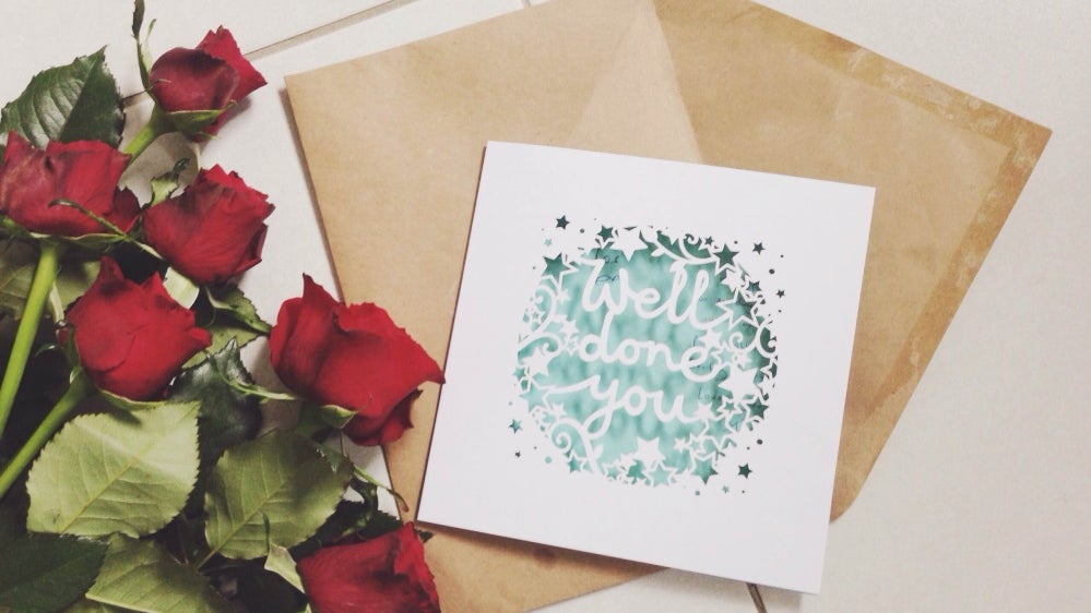
If there’s one thing we never get tired of on the internet, it’s beautifully styled photography. The newest way to take these photos is shooting top-down, or as it’s known in the blogging world, a flat lay – a classic, simple and chic way to show off your current addictions and favourite objects in a pretty way. There are endless creative opportunities for styling top-down photos, but it actually seems to be one of the trickiest things to get right. These tips will not only help you to style the perfect photograph, they’ll also help you to make it look great with BeFunky, too.
Choose a Basic Background
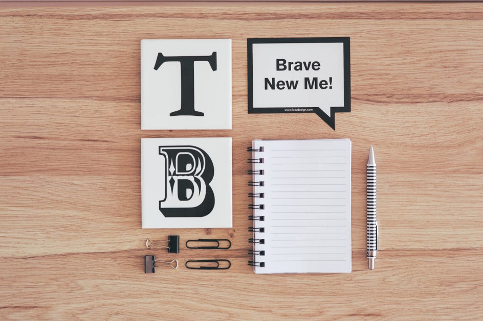
Before you even start to think about what you want to include in your photo, you’ve got to pick your background. White, grey or wood backgrounds are the best for any type of top-down image, because they’re versatile and simple. If you’ve got white bedding, a white desk or wooden floors, they’re perfect foundations.
Remember Your Lighting
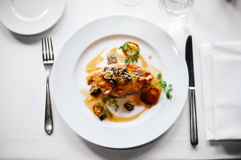
One thing that can stop you from taking the best top-down photo is lighting – pick the wrong time of day and there’ll be shadows cast over your photograph which won’t be as flattering. BeFunky’s Photo Editing app can help you make it look perfect, but the shadows will still be there. Natural lighting is what you need. Take your photo at a peak time during the day underneath a big window if you can.
Pick Your Objects
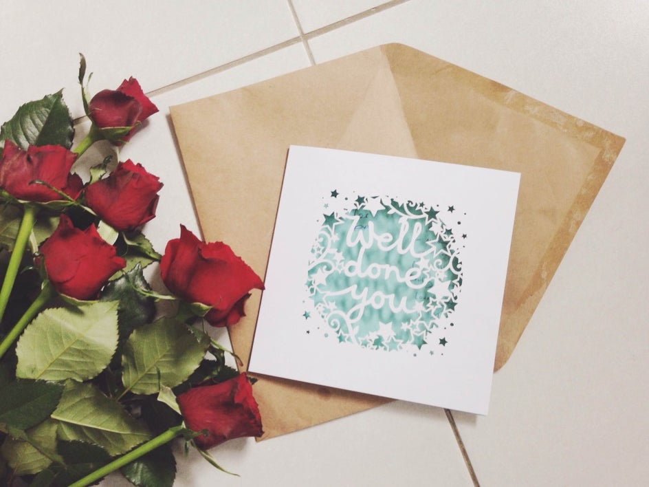
When it comes to styling your photo, one of the most important things to think about is the purpose of it. That way, you can pick items and colours that emphasise the purpose of it and work to complement each other. It can be tricky to choose the right props for your photographs, but there are failsafe ones you can always use – magazines, books, cards and postcards are great because they’re already flat and look great from above. Likewise, flowers look beautiful when they’re layered into the photograph, as do candles, notepads and decorative accessories you’ve got around your home.
Add Texture
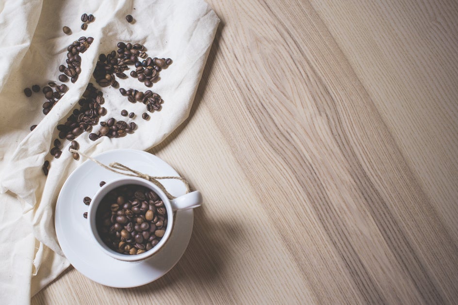
To add texture to a top-down photograph it’s all about choosing different products and materials that work well together. In the image above, the sheet creates a simple, yet wonderful element to what would otherwise be quite a plain photograph. You can experiment with flowers, lace and small colourful fruits.
Leave Space Between Your Items
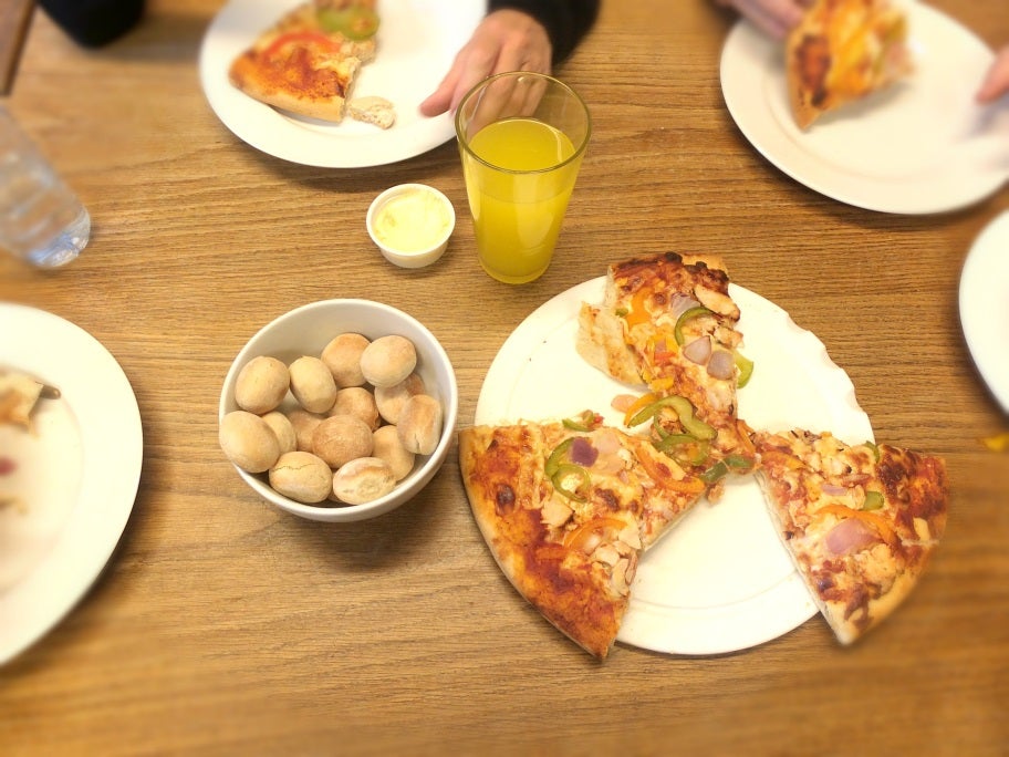
You don’t want the photo to look too cluttered, which is why it’s important to leave just the right amount of space between your items. Your instinct will tell you when you’ve got the right balance. A good way to measure is by looking at how much of your background is on show.
Try Not To Go Over The Top
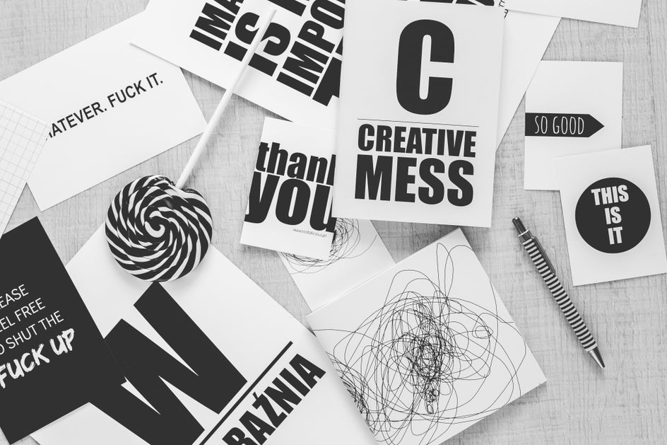
Simplicity is key for a top-down photo. Trying to include too many different elements or too many colours will take away the beauty of it. Show your viewer exactly what you’re trying to stay in one theme and with your own style. Having a Sunday afternoon at home? Candles, magazines, a cup of tea = tick. Having a Sunday afternoon out? A teapot, cakes, sunnies = tick. The best top-down photos are interesting, but simple.
Editing
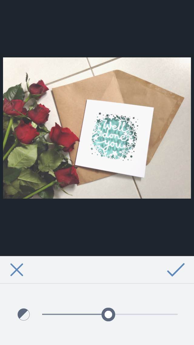
When it comes to editing with BeFunky’s Photo Editor, you want to do one thing – emphasise the most important elements of your photo. Make the background light, make the colours rich. After that, you’ll have the perfect top-down photo.
One More Thing To Remember:
Use a tripod. It’ll make your images look a hell of a lot better - trust me.
So why not go for it and take your top-down photos to the next level?
