4 Common Collage Mistakes – and How to Fix Them

Collages are a great way to showcase a collection of related photos, whether it be from your most recent holiday, graduation, or springtime adventures. And while BeFunky’s Collage Maker makes it incredibly easy for you to create your own collages, there are some composition tips you should keep in mind.
From having too many similar images and excess negative space, to too many distracting elements and more – there are plenty of reasons why your collage might be looking less-than-perfect.
Thankfully, we’ve outlined the main mistakes you could be making with your collage, as well as the simple solutions to help you overcome these!
Mistake #1: Your Images Are Too Similar
It can be tricky choosing your favorite images, especially when you’ve captured a series of photos from a single event or location. Often, these tend to all look quite similar, so it’s important to only select images for your collage that offer enough points of difference to keep it interesting.
Take this collage, for example, which features a series of images from a lakeside proposal, each very similar in nature.

By switching out some of the images for those which feature different compositions, we’ve created a collage that’s more eye-catching and balanced.

Mistake #2: The Colors Clash
The color palette of your collage is easy to overlook, yet it forms a key part of your overall design and its effectiveness.
If a collage is filled with various clashing colors, it can appear too busy. If it contains images with colors that are too similar, however, it can look a little washed out – just like this example below.

The key to creating a beautiful collage is to select a color palette featuring just 2-3 key colors. For ultimate harmony, you can even stick to images that are just warm-toned or cool-toned.
In this collage, for example, we included photos featuring a color palette mainly consisting of red, brown, and orange – all of which are warm-toned. The light orange hues break up the previously all brown and red tones for a pop of contrast.

Mistake #3: There’s Too Much Negative Space
Negative space refers to the empty space surrounding the photo’s subject. Too much can create feelings of isolation and disconnection among the collage’s images. In this example, our images fail to flow seamlessly from one to another.

While it’s fine to have some negative space to give certain subjects room to breathe, it needs to be balanced. In this example, we simply swapped out some images for ones featuring a more varied composition. We also zoomed in on others so there was less negative space surrounding the subject.

To do this within the Collage Maker, click on the cell you wish to change, then select Edit Image. Underneath Size, simply move the slider to the right to make the image larger, and therefore more zoomed-in within your collage.
Mistake #4: There Are Too Many Distracting Elements
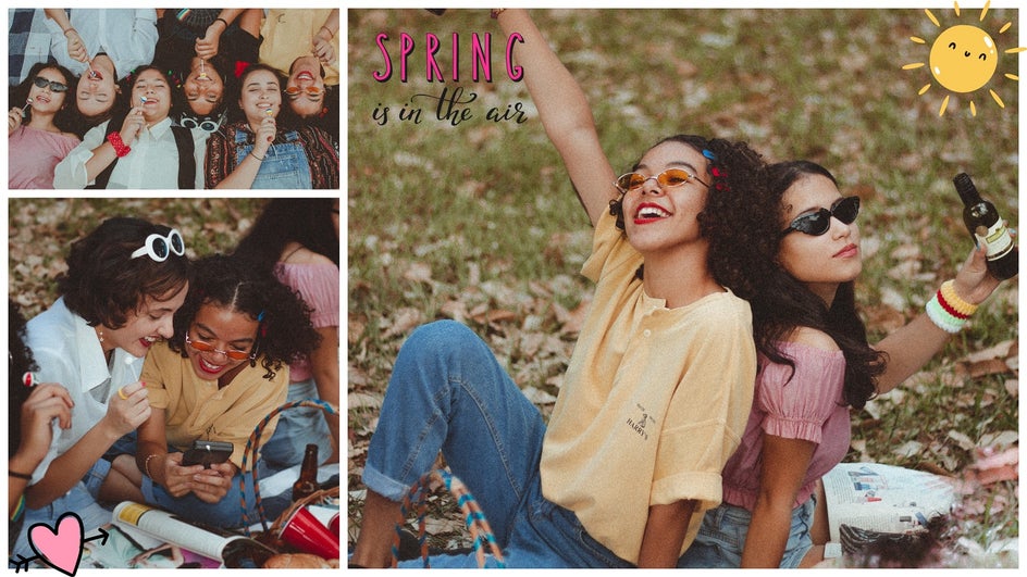
With BeFunky’s huge Graphic Library, it can be tempting to cover your collage in fun and colorful designs. As with most things, however, moderation is key. An expertly placed graphic here or there can help your collage to pop. Yet, placing graphics all over your collage design can have the opposite effect.
Take this collage, for example. There’s simply too much going on, so it confuses the viewer’s eye and is overwhelming.

By sticking with just 3 graphics and changing the sizing of each, it looks far less busy. Each graphic adds a fun element to the overall collage, rather than clashing with the surrounding imagery.

Craft Beautiful Collages With BeFunky
Now that you’re aware of the most common collage mistakes, you can be sure to avoid them for future projects. With the Collage Maker’s easy-to-use and helpful features, however, these mistakes can easily be a thing of the past!
So, what images will you use in your next collage? Head to the Collage Maker to start an amazing project today!


