Google+ Is Not Dead! Let’s Create Your Google Cover Photo

Is Google+ Dead? I mean who is actually using the platform? A lot of people and growing according to USA Today,
“Vic Gundotra, head of social at Google, said Google+ has 300 million monthly active users, up from 190 million in May.” ~Alistair Barr
The integration of Google Services, including YouTube, makes Google+ a powerful force in the social media world. It can give your blog posts and website some great SEO juice. If you are not making use of Google+, now is the time to create an optimized banner and get socializing!
The great thing about Google+ covers is their larger size, giving you more space to show off your personal or brand’s personality. The ideal size for the cover image is 1080 x 608. Fortunately, with the BeFunky Designer, we never have to worry about sizing our social media headers, because we can use optimized Google Plus templates that are perfectly sized & ready to go. Ah, the sweet bliss of not having to look up social media image sizes. It's a beautiful thing.
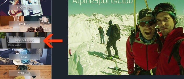
So, what do you put in all this space?
Google+ is full of designers and photographers, which means there is a wealth of inspiration out there. A picture, along with a headline and some text, seems to be the go-to design of YouTube and Social Media rock stars. Check out these examples and then let’s get creating…
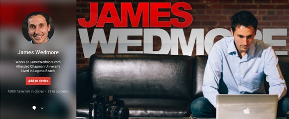


These are great examples for small businesses to add that personal touch. First let’s remove the default picture and logo and change our background color to white. This will give us a blank slate to work with...
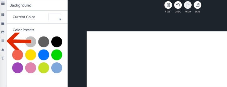
You do not have to use a color preset. To change to a custom color, simply click the small, down arrow on the “Current Color” box and put in your code. So many options to adjust to the feel you want to create! Purple for example:
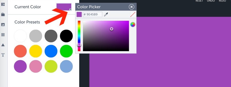
You can always change the background color after you add your images if you change your mind.
Next, let's add a photo. With all this space, it's a great time to get creative! Here are a few ideas of what to show off on your banner:
- Your Team
- Behind The Scenes
- Product Creation
- Your Funky Office
Maybe you run a small graphic design company. Use the G+ Cover area to showcase your team's work. Using the Image Manager, we can upload created graphics and resize to create a captivating effect.
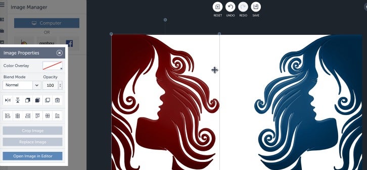
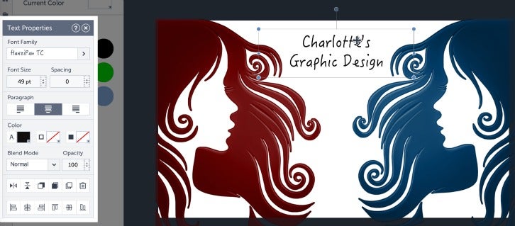
Add your text or small business logo. If you missed the Small Business Logo Tutorial, you can find it here: DIY Logo
We could leave it as is or change the background to a brighter color. The white gives a clean feel while the yellow adds the "funky." It all depends on the vibe you want to create with your business.
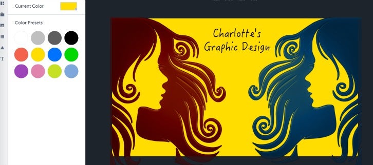
Have fun playing around to create just the right look for your small business.

Then, download to your desktop and upload to Google+. Here is an example of what the result could look like on your profile:
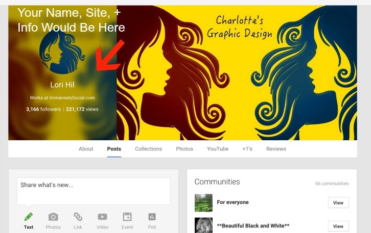
This is just a very simple example of what you can do. Keep in mind that the main area of your cover will duplicate behind your profile picture, as you can see. You can use the BeFunky Designer Overlay Feature to create some fabulous collage style covers too. Let me know if you would like to see a tutorial of that.
Be sure to leave your comments. I would love to see your creations!
